Web development evolves rapidly, and modern browsers constantly add new CSS features. However, not all users use the same browser or version. This is where CSS feature queries come in—a powerful tool to check browser CSS support and adapt styles according to the browser’s actual capabilities.
In this article, we’ll explore what CSS feature queries are, how @supports works, and why they are essential for building modern, robust, and cross-browser-compatible websites.
What Are CSS Feature Queries?
A CSS feature query is a conditional rule that checks whether a browser supports a specific CSS feature.
Feature queries belong to the CSS Conditional Rules module, the same module that defines media queries. Unlike media queries, which test environmental conditions (screen size, orientation, resolution), feature queries test whether a browser supports specific CSS features.
| Media Queries | CSS Feature Queries |
|---|---|
| Test the environment (screen, resolution, orientation) | Test CSS browser support |
Use @media |
Use @supports |
| Depend on hardware | Depend on the browser |
| Screen-adaptive | CSS-capability-adaptive |
In summary:
-
Media queries adapt to the screen.
-
CSS feature queries adapt to the browser’s CSS support.
Basic Syntax of @supports
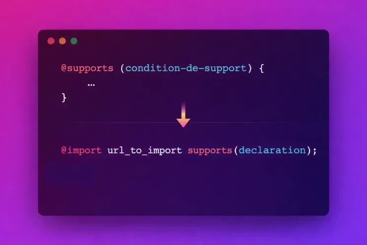
Feature queries use the @supports rule, which accepts a condition on a CSS property. You can also use the supports() function in @import.
Simple CSS Feature Query Example
Suppose you want to check if a browser supports the row-gap property:
HTML
CSS
In this example, if the browser supports row-gap, the styles inside the @supports block are applied. Feature queries can test both properties and specific values, giving precise control over rendering per browser.
Testing Specific CSS Values
CSS feature queries can also check support for specific CSS values:
This allows you to adapt styles per browser and optimize the user experience.
Testing Lack of Support with @supports not
You can also target browsers that do not support a feature:
This ensures robust fallbacks and a consistent experience across partially supported browsers.
Combining Multiple CSS Conditions
Multiple conditions can be combined using and, or, and not:
This ensures that all necessary features are supported before enabling a complex layout.
Advanced CSS Feature Queries
Feature queries go beyond property/value pairs. You can also use:
-
selector(): check support for a specific CSS selector. -
font-format(): test support for a font format (woff2, opentype, etc.). -
font-tech(): verify if a font technology is supported.
Examples
Selectors
Font Formats
Font Technologies
These techniques enhance performance and ensure optimal browser CSS support.
Limitations of CSS Feature Queries
While feature queries allow you to check browser CSS support, they have limitations:
-
They cannot guarantee full implementation of a feature.
-
They cannot detect bugs or partial implementations.
-
A browser may claim to support a feature without implementing it correctly.
Thus, it’s recommended to follow a progressive enhancement approach, always defining reliable default styles.
Conclusion
CSS feature queries and @supports are essential tools for modern web development. They let you leverage advanced CSS features while maximizing cross-browser support.
By using feature queries properly, developers can create robust, performant, and compatible interfaces, without relying on JavaScript for compatibility. This approach improves code quality, performance, and user experience, all while respecting progressive enhancement principles.
For more information on CSS feature queries and conditional rules, consult the official MDN documentation:
MDN: Using Feature Queries